Life Is Strange: Double Exposure - Accessibility Case Study
For Life is Strange: Double Exposure — a coming-of-age story about ordinary people with extraordinary powers — including players with disabilities was more than a line on the production roadmap, it was about ensuring as many people as possible could embrace the story of human connection that defines Life is Strange’s storytelling.
From an inclusive story to an inclusive game
Striving for broad inclusivity is a noble and difficult goal. Accessibility efforts with good intentions are easily stalled or ineffective in their execution — producing subtitles that are too small, or colourblindness modes that simulate rather than mitigate colour similarities. By contrast, Life is Strange: Double Exposure’s award-winning inclusive design is a high tidemark for both the series and the genre.
“At Square Enix, we strive to deliver unforgettable gaming experiences to as many people as possible… Because ultimately, gaming should feel fun and empowering for all, right?” – Square Enix for Global Accessibility Awareness Day 2020
So, how did Square Enix, Deck Nine, and Player Research approach this mission? And how did we join forces to make sure Life is Strange: Double Exposure was accessible to many more players?
A picture is worth a thousand words
Accessibility is not one-size-fits-all. Players can exhibit a wide range of needs – hearing, visual, motor, cognitive, and beyond. The accommodation of each requires different features and design considerations. Prioritisation then becomes a tricky balancing act: aiming to make the game accessible to all needs means spreading resources too thinly, risking making it an equally poor experience to all audiences; yet focusing on just a single needs cohort risks making the game totally inaccessible to other groups. Clever compromise is required.
For Life is Strange: Double Exposure, Square Enix aimed to deliver best-in-class accessibility for one category of accessibility needs, while also sustaining strong inclusive design in other needs categories. This approach worked toward the greatest impact deemed feasible.
Designing for Low Vision Players
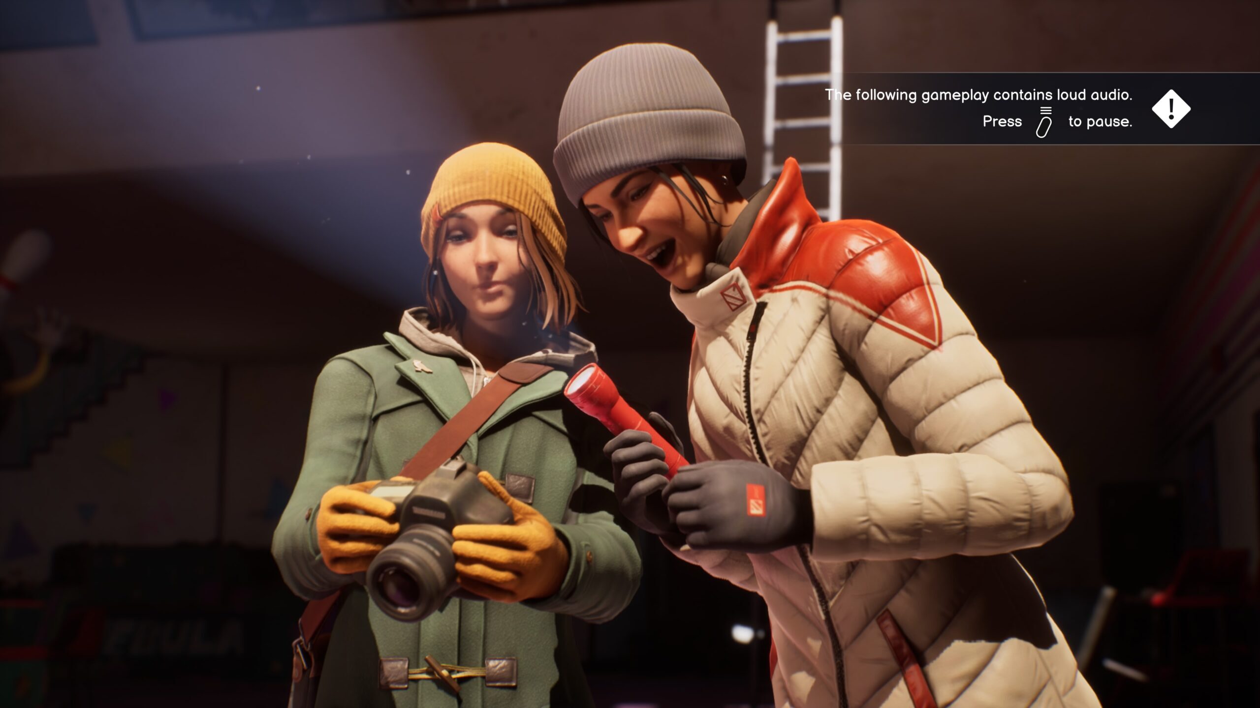
Life is Strange games feature cinematic visual stories. Rich and compelling imagery are the backbone of the series’ storytelling and gameplay.
Inevitably then, if you make visuals inaccessible, you’ve lost the plot. Imagine a low-vision player being unable to read dialogue subtitles, to read what dialogue choices the UI presents, or to identify clues to investigate.
Without accessible visual feedback, the story becomes incomprehensible, and the emotional connection central to Life is Strange is lost. So Square Enix purposefully chose to focus accessibility efforts on best-in-class visual accessibility for players with low-vision and colour blindness.
“Testing with players who had low vision would be a huge indicator for us, they could provide a broader sense of where gaps might exist.” – Rodrigo Sanchez, Accessibility Manager – Square Enix
Designing Requires Testing
From the outset, the game design was inclusive. From an early stage, it had been road mapped to have settings and considerations tailored to meet a variety of accessibility needs. Like all design activities, everything is a hope and hypothesis until it’s in the hands of real players. For accessibility features in particular, the wide range of needs and complexities means that player research with disabled players is must-have exercise.
“I had heard that Player Research was developing a service that could help address gaps within our team. Working with some of you before helped establish rapport and improve communication, knowing the quality of your work, we saw this as a promising starting point that could help our own user research department understand how we can support them.” – Rodrigo Sanchez, Accessibility Manager – Square Enix.
Imagine all the human resources and budget poured to developing amazing accessibility functionalities that players overlook, can’t find, or don’t deliver.
As you’ll see throughout this article, this might well have happened… fortunately Square Enix/Deck Nine had the foresight to playtest and rework their efforts. They knew they needed both internal and external validation from leading experts in the accessibility field as well as real player feedback.
The Player Research Method
With 13+ years of experience conducting all kinds of games research across more than 600 titles, and with our commitment to “Advancing Accessibility”, we were the ideal partner: we had the experience, the methods, the people, and the values to deliver actionable and genuine insight.
Running accessibility-focused playtesting sessions requires substantial experience and readiness: building a safe space, finding the right playtesters, building a rigorous test plan, and turning that rich data into actionable insight for studios to build on.
Recruit the Right Players
To ensure the perfect playtesters’ voices were invited to contribute, our dedicated Participant Recruitment Coordinators at Player Research — Ely, Leanne and Ellen — cast a wide net, placing invitations on social media channels, private communities, and support networks. Throughout the process, the team screened more than 4,000 prospective players for the playtest. We enquired about their play habits in an online ‘screener’ survey, asking them “what games do you play?” and staying on the lookout for players who had dozens of hours in the Life is Strange franchise or in similar games.
In playtester recruitment, screener surveys alone aren’t enough to ensure high-quality playtesters are selected. Our PRC team followed up with one-on-one phone interviews with selected players, diving deeper into what players liked about Life is Strange and other similar titles. We asked specific accessibility questions such as “What options do you typically turn on?” and “what types of accessibility barriers do you commonly face when playing games?’’. This helped uncover players who needed colourblind-friendly designs, customisable subtitles, contrast modes, and other visual accessibility features. Crucially, the focus was never on what disabilities, but what accessibility needs players had.
From those 4,000 applicants we selected twelve initial playtesters who met our key criteria: actively using relevant accessibility options and with a strong affinity for the genre. We had our players, so what next?
Designing the Playtests
An old user research saying goes “behaviour never lies”. Actions speak louder than words, so Player Research’s Accessibility Lead, Améliane designed a research plan to capture as much true player behaviour as possible that would reveal accessibility pains and blockers.
We tested in a living room-type scenario, within our secure and purpose-built playtest facilities in the UK. Our lab’s interior design and furniture mirrors players’ home setup, so we can make sure they’re comfortable and play naturally, as they would at home, all while keeping the game secret from prying eyes.
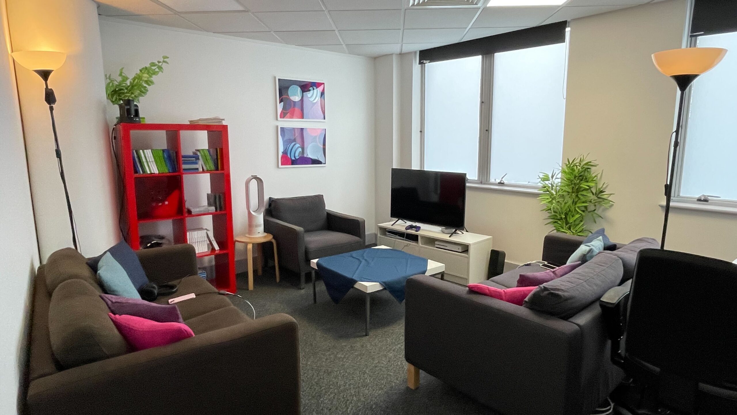
We used a realistic but challenging TV-size-to-distance ratio. Given the visual accessibility focus, our accessibility team recommended to replace the fancy 4k HDR VRR 65’’ TV in the lab with a smaller 1080p 42’’ one and move the couch 2 meters (80 inches) away from it. This allowed us to ‘pressure test’ the game’s visual accessibility. The smaller and lower-resolution TV makes all visual elements smaller and less well defined – if players had no issues on a 42’’ screen, they were unlikely to face problems on a 65’’ one. Conversely, testing with a 65’’ TV could have led to false positives, as the larger screen might mask accessibility issues that wouldn’t translate to typical player setups. The reality also is that most game development and testing happens at a desk, barely a few feet away from a PC monitor, which does not reflect the set-up of so many players at home.
Being able to observe and see [the playtests] firsthand made a huge difference in the results, which I believe were quite beneficial in the long run. An example would be when I expected something to happen, but the outcome turned out to be completely different.. Accessibility Manager - Square Enix
Playtesting
We tracked every move the players made. Gameplay streams monitored in-game interactions and visualised the buttons pressed on their controller, while several remote control cameras captured players’ real-life behaviours (e.g. leaning closer to the screen). All data sources were synchronized and transmitted to an observation room so our Researchers could observe and analyse their every move in real time.
Players were asked to fuss with the settings as they normally would. We focused on moments where players made proactive changes – changing settings such as turning off camera shake or switching to Dyslexia-Friendly font, as well as the context in which these changes were made.
This revealed successes and failures for players, where issues were addressed by changing an option and the player could continue playing more smoothly, or sometimes not. We also hunted for behaviours that revealed potential issues, such as repeatedly visiting the same location without making progress or changing the lighting in the room to be able to see something.
Players were shown content that exposed all the games’ core mechanics, and content deemed likely to present barriers. Researchers then used ‘semi-structured’ interview techniques to encourage players to share their experiences freely, without priming or biasing questioning. This approach ensured data reliability, as insights were voluntarily provided by players, and helped prioritise areas for improvement by highlighting the most prominent issues.
Behaviour speaks louder than words
Importantly, the interviews were informed by observations, allowing researchers to delve deeper into specific behaviours. In one key instance, Kai* said that they could track the game’s different timelines just fine, but observation showed them repeatedly switching timelines back and forth in a short span and sometimes pressing LB and RB simultaneously (only LB swaps timelines). This implied the player didn’t know how to deliberately use Max’s power, so we asked how they do it (instead of naively asking “is it easy to do?”):
Researcher: How do you switch timelines?
Kai: [Hesitated, after a brief pause] I am not sure.
This moment highlighted an important barrier: while Kai was aware of what indicated their current timeline, the actual process of how they switched remained unclear. What caused this would only be discovered later on.
Another playtest session highlighted another barrier: During interviews, when asked how it felt to read the subtitles, Alex said “Automatic size (of the subtitles) is pretty good, especially with this TV. So far, I haven’t had any problems.” Jesse and Riley echoed similar sentiments. And yet they all increased subtitle opacity and added backgrounds, suggesting they had readability issues before that point, or otherwise preferred the non-default subtitle treatment they had created.
When accessibility became… inaccessible
When Player Research got access to Double Exposure, the game already had a suite of smart UX and UI tweaks borne of inclusive design intent and many accessibility options aiming to support players across the accessibility needs spectrum. But when we put the game in front of actual players, they sometimes didn’t or couldn’t use them.
In the world of game accessibility, one of the ways we can expose and explain barriers is by using a more game-centric version of the ‘’POUR’’ principles. Originating from the Web Content Accessibility Guidelines, the ‘’POUR’’ principles aim to provide a mindset blueprint for accessible design. In gaming, we can augment them with games UX principles to better identify the nature behind barriers encountered.
A game-centric version of POUR looks something like this:
- Perceive: Information is presented in a way that players can notice and perceive.
- Operate: Players can successfully engage, interact, and navigate in the content and its related menus using the input device of their choice.
- Understand: Players can easily interpret and comprehend information, instructions, and cues provided by the game.
- Robust: The game and its contents are reliably and consistently accessible across all supported platforms—regardless of which assistive technology is used. Additionally, the options and features implemented work as intended.
If any one of the above traits fails, the feature or content becomes compromised. This can also affect usability but is even more critical in the context of accessibility for players with disabilities.
For Life is Strange, some of the accessibility issues were rooted not in the lack of options and design considerations available, but players’ inability to perceive and understand them.
I really appreciated how Player Research presented the findings; it was very straightforward. There was context, images, and design recommendations, all laid out in a way that was very easy to digest.. Accessibility Manager - Square Enix
Accessibility Playtest Findings
Example 1: When players can’t see the solution right in front of them
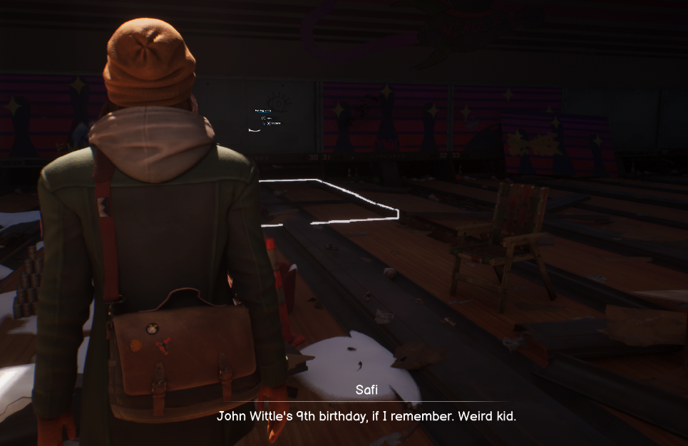
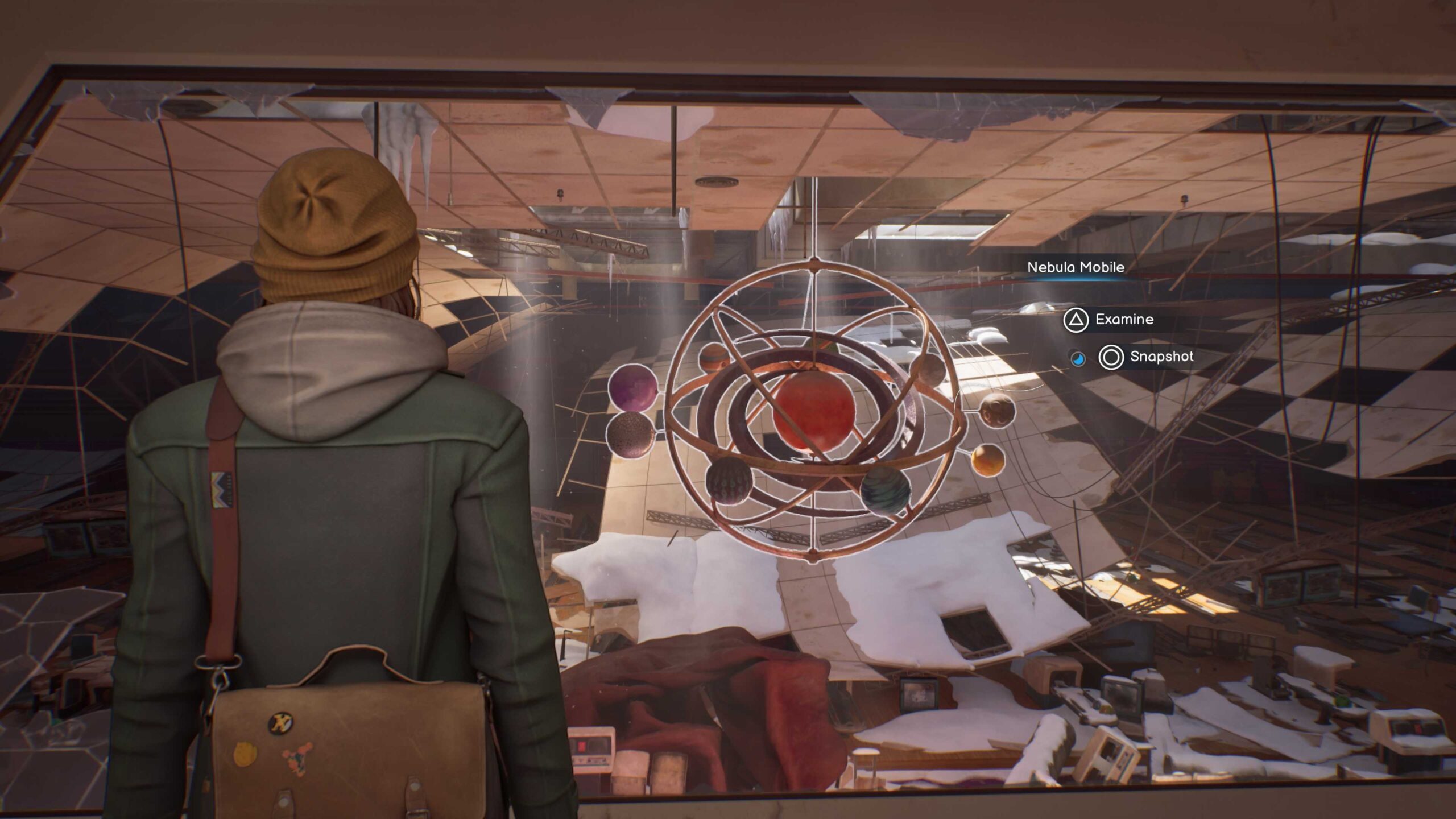
The very first blocker players encountered in the playtest stemmed from a failure to perceive. In the Nebula Bowling Alley area, when in search of taking the last photograph, we saw players exploring every corner, back and forth, back and forth. They kept this up for considerable time.
Jesse spent 8 minutes here, Riley spent 13! When asked about it, believing they had thoroughly searched the area but had been unable to find the last interactable, players were blocked and frustrated that they couldn’t progress. This was far longer than the design had intended for the seeking process to take. All the while, they repeatedly passed by the prompt for taking the last photograph without recognising it. And perhaps you wouldn’t either… because it’s so small.
Acting on this insight
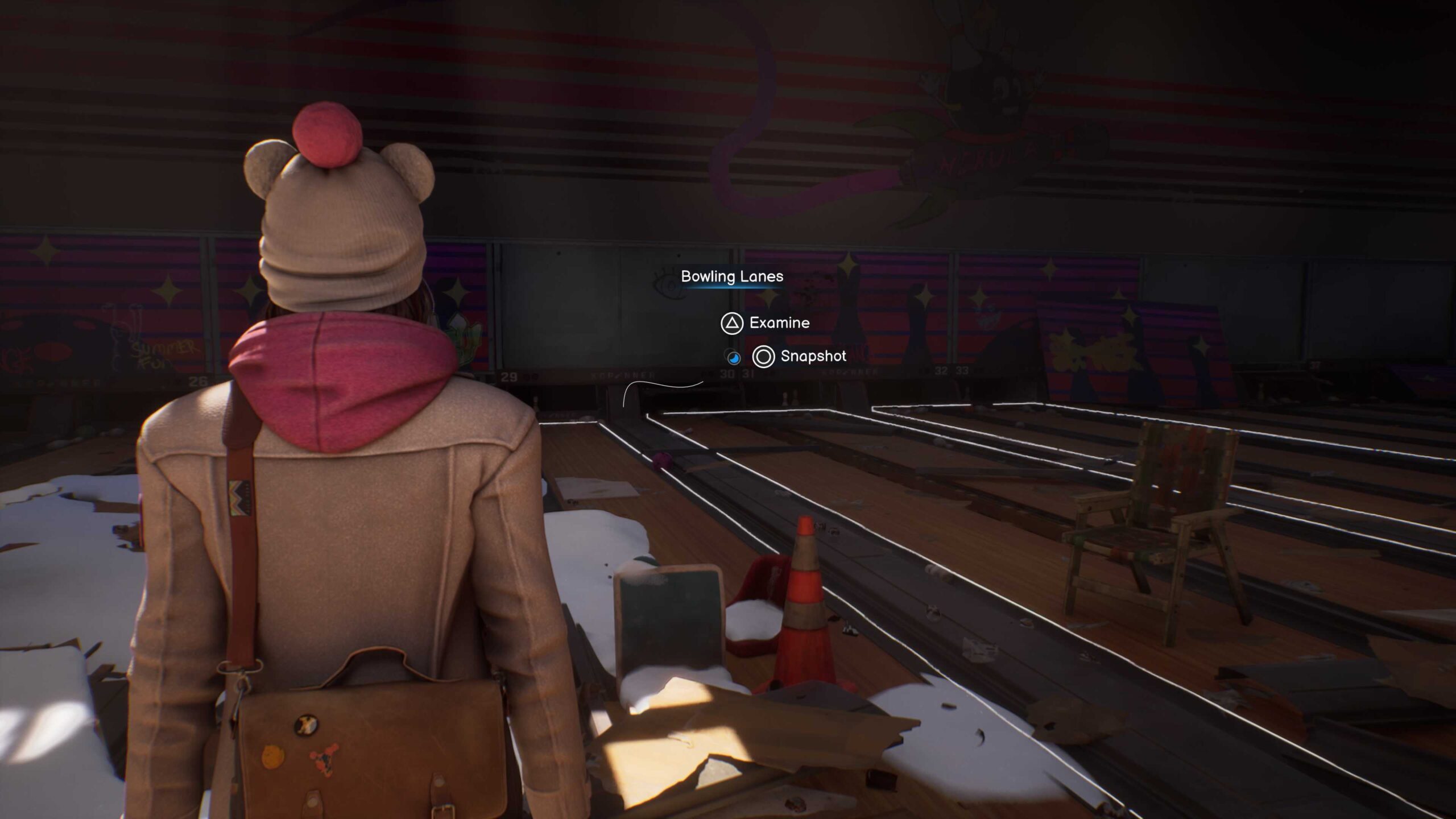
While prompts near Max were visible, those farther away were sometimes missed as the prompts scaled down with distance. Not a problem for most interactables, as players can just walk up to them and be near enough as to maximise the prompt size (see screenshot of normal interactable below). However, in the Bowling Alley area above, obstacles stopped players from getting close enough to even spot there was a prompt at all, let alone read the choices or the button prompt options. So, players just walked on by time and time again, not noticing it, or noticing it but not knowing what button to press.
The solution was having larger prompts regardless of player’s proximity, ensuring they remained as readable from afar as when nearby. Turns out adjusting prompt size didn’t just fix this problem, it fixed others too.
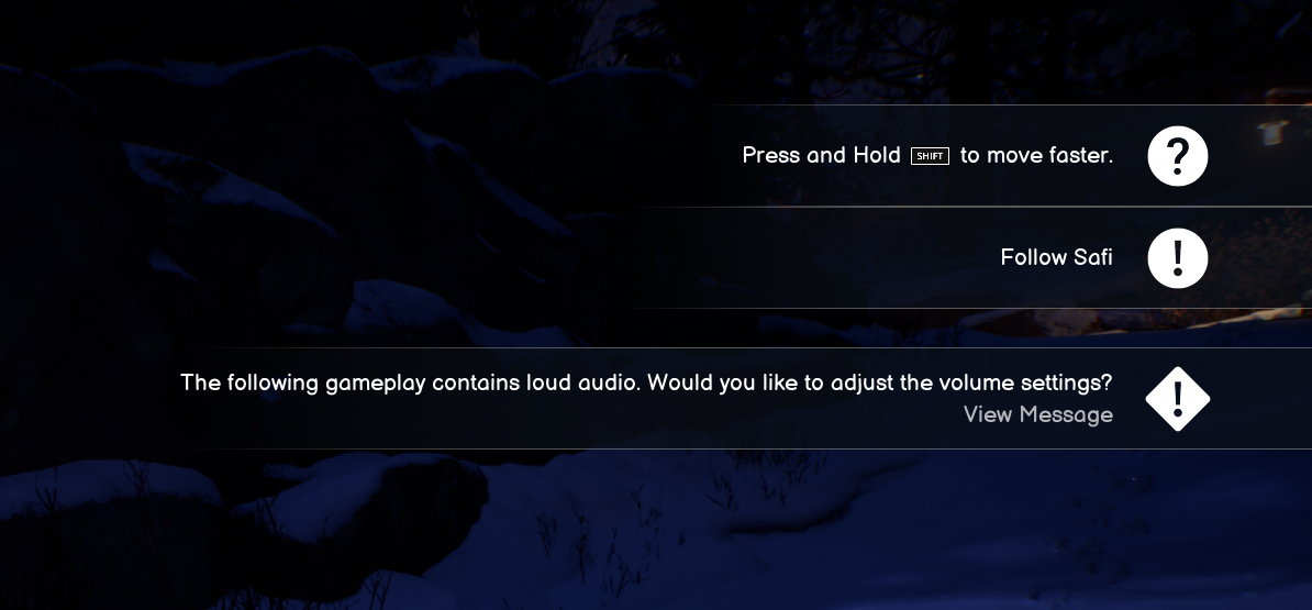
Example 2: When an alarm rings too quietly
Content warnings are meant to help – players with arachnophobia certainly don’t want to see a spider crawling on the screen. But an alarm that’s too quiet won’t wake you up – just like a content warning that’s too late or easy to miss exposes players to content that can harm them. This also is an example of the ‘’Perceive’’ and ‘’Robust’’ principles missing the mark due to the feature not working as intended.
(Tiny story spoiler ahead)
During the playtest, Max and Safi’s photo exploration nearly ends in a near-accident as a Nebula Mobile hanging from the ceiling collapses barely missing our protagonists. A few seconds before it, a content warning ‘Loud Audio’ appeared so players with hearing trauma and pain could turn down the volume ahead of it. (Tiny story spoiler end!)
But when playtester Jesse experienced the scene, things didn’t go as expected: “I saw the warning, but it felt like the loud sound played first.” By the time they processed the warning, Jesse had already heard the loud sound; only then did they pause and lower the volume – after the crashing sound.
In other cases, players didn’t even notice the warning messages, because they occasionally appeared alongside other pieces of information, creating a cluttered block in the top-right corner. This made it more difficult for players to perceive, let alone absorb, the content warning in a timely fashion.
Acting on these findings
A simple solution was to display the warnings earlier to give players more time to register them. Making warning messages more noticeable and easier to process would also help, so instead of relying on text alone, developers shortened the message and introduced a pause button icon – something that catches the eye more easily and removes uncertainty about how to react.
What if players needed even more time? Many players with visual or cognitive disabilities can struggle with noticing and processing such warnings, no matter how much time they have. So, a one-size-fits-all solution wasn’t enough.
That’s where the “Content Warning Pause” option came in. We proposed that players need to actively acknowledge Warnings when they appear before showing the triggering content and Deck Nine implemented it! Now, players who want can enable this feature in the accessibility menu. It automatically pauses the game and keeps warnings on screen until players are ready. This ensures no one is forced to rush through a crucial warning.
Lacking the time to react to a Content Warning isn’t just an inconvenience – it can be a serious health risk. Imagine a photosensitive player at risk of PSE seizures who misses an incoming flashing light warning: the risk could be damaging to health. While this playtest didn’t include players with epilepsy, it showed how easily such warnings could be ineffective, making health risks a tenable possibility. Changing this system meant a lot of the Life is Strange playing experience is less harmful and less stressful to those players.
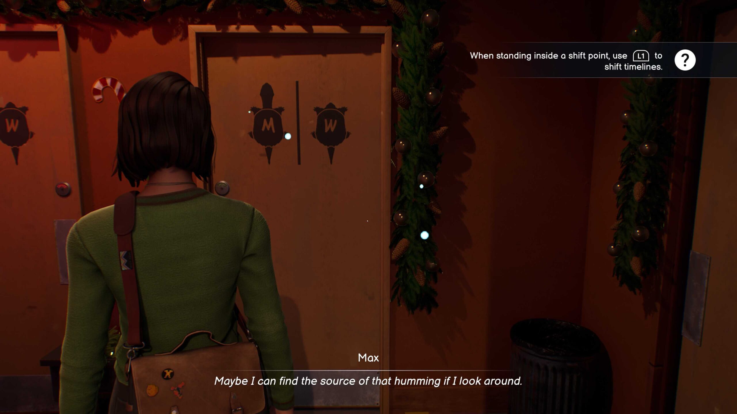
Example 3: When prompts fail to teach
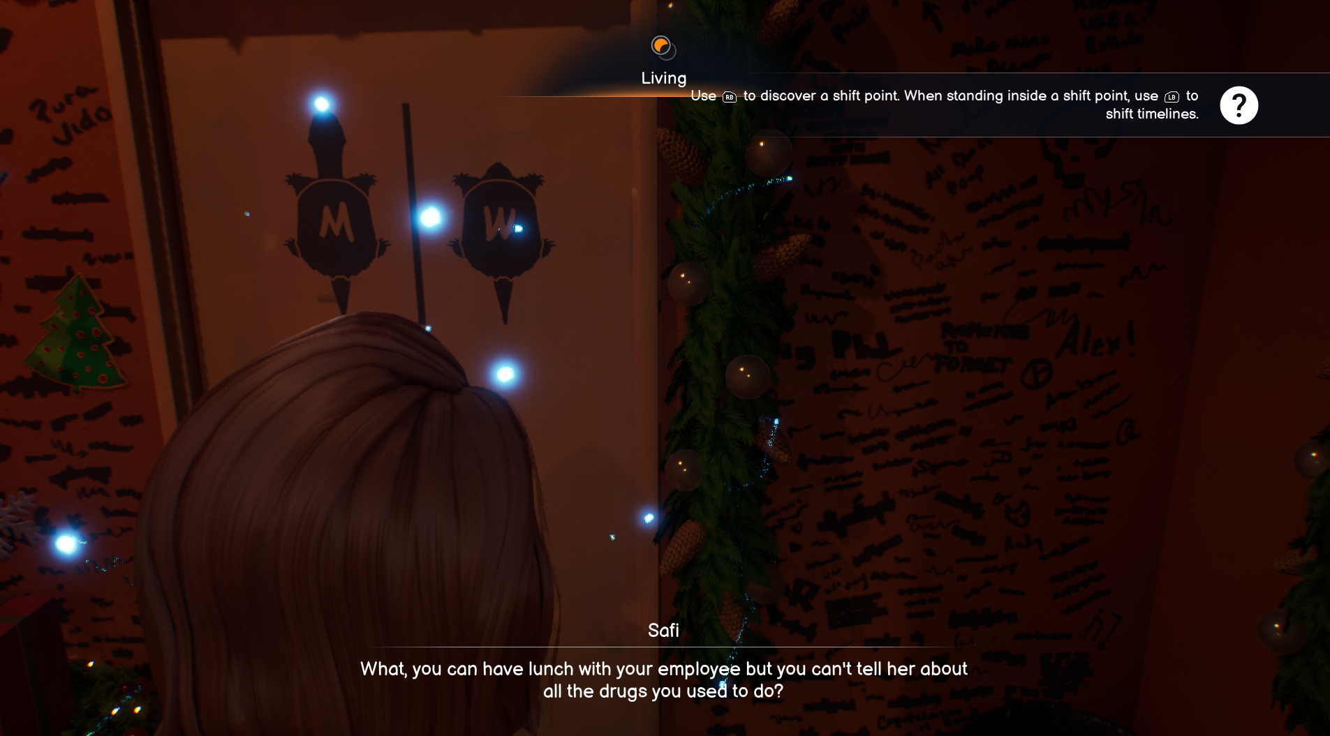
If content warnings designed to help prepare for sensitive moments can be overlooked, were other UI prompts easy to miss and how was that impacting player experience? Remember Kai? They struggled to understand the controls for timeline switching.
Researcher: How did you switch timeline?
Kai: [Hesitated, after a brief pause] I am not sure.
Researcher: Could you tell me more about it?
Kai: When switching timelines, I couldn’t tell if I was doing it correctly… I saw something about pressing LB and RB, but I can’t remember.
They tried different buttons to see what would happen. The connection between action and outcome was unclear so Kai couldn’t reliably associate pressing LB with shifting the timeline.
Why did this happen?
The original prompt explaining how to shift timelines was long and appeared too briefly before disappearing – a similar issue to the content warnings.
A straightforward solution might have been to keep the prompt on-screen longer – but in games, players often don’t stop to read lengthy tutorials.
Instead, our Researchers suggested to refine the prompt itself: shorter, clearer, and easier to remember. The first half of the message was trimmed to focus only on the essential information when players get close to the shift point.
Additionally, the button icon was enlarged to improve visibility and readability.
Accessibility from the start, test to the end
It’s by no accident that Life is Strange’s accessibility has gotten such incredible reviews and was nominated for ‘AAA Excellence’ at the Games Accessibility Conference 2024.
All the above examples of issues, and how they were quickly identified and fixed, neatly proves that teams should rely on accessibility testing to reach their inclusivity goals, supplementing internal inclusive design efforts.
Many of these award-worthy features had been road mapped and built into the development process from the project’s beginnings. Having done so allowed late-stage research and iteration time to focus on refinement rather than rework, delivering a far more inclusive game
The feedback from players with disabilities from the gaming communities was very positive. Winning awards for our efforts was unbelievable. We were nominated for several accessibility awards and even took one home, which was amazing.. Accessibility Manager - Square Enix
Keen to reach more players and improve accessibility for your game?
Find out more about how we work with game developers on accessibility here or email us on [email protected] to chat about how we can work together.
